CeeLo Green:
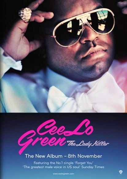 This magazine advert features only CeeLo Green, as he is a solo artist. The colours, mood and style reflect his own personal style and genre of music; the subdued pink and orange tones against the blue is reminiscent of the soul/RnB genre. Likewise, the "glamour" of such genres is represented in his crisp white shirt, bow tie, gold rimmed sunglasses and large gold ring. The colour of the font section matches the colour of the image which creates a sense of flow and consistency. It is visually pleasing to draw a visible connection between the image and font particularly as his genre of music is often very smooth and calming. The pink, feminine font links with the album title "The Lady Killer" as it is evidently about women. Below the eye-catching artist name and album title is the release date and a review of the album. It would be particularly good to include a made-up review from someone reputable like The Guardian with five stars as in reality, this would help the album sell.
An example of another student's magazine advert:
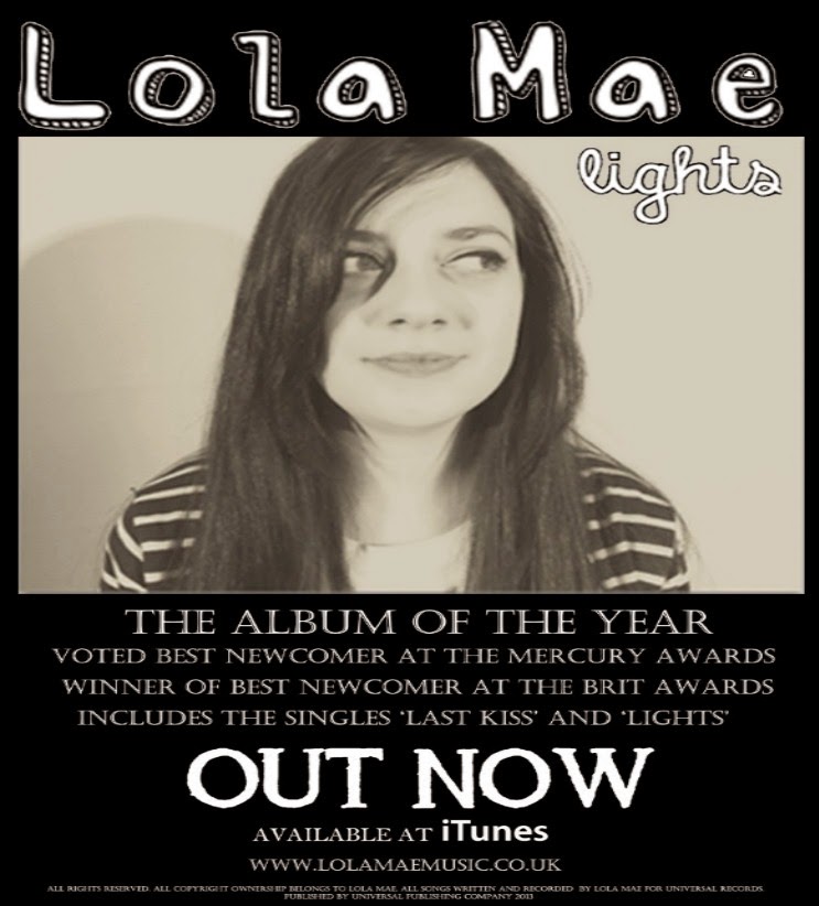 I find this to be a reasonably effective magazine advert as the sepia colour scheme is consistent throughout making it visually pleasing. However I feel that without some eye catching image or a bold coloured font/section like on CeeLo Green's advert, it may become less noticeable in a magazine where there will be other articles, font styles and colours surrounding it. The album title and image work well together as there appears to be a brighter spotlight shining onto one side of the artists face. Also, the size difference between the artist's name and album title are effective as it is the name of the artist that will attract the audience's attention first. I feel that although they lack the use of a bold title colour, the clear positioning of the artist name makes up for this. Perhaps there is too much writing- audiences won't be reading paragraphs on an advertisement that they are likely to just skim through so it is essential to keep it sharp, informative and clear. Nevertheless I like how the student has included the "available at iTunes" notice with the recognisable logo in bold. This also increases the realism of the advert alongside a "terms and conditions" section in small print at the very bottom.
Some other examples of magazine adverts from current female artists:
Although they all produce different music the adverts all work effectively in the same way. Each advert includes an individual image of the artist with the name in bold which tells the audience that they are a solo artist. I have found that images against a plain background work best as it looks less cluttered. They also give information about singles on the album, reviews and availability.


1. Do it on A4 or A5
2. Include pictures that I have manipulated/altered in some way and explain how/why I have manipulated it
3. Include the name of the album, artist, release date
4. Refer to availability – e.g. ITunes, HMV, Amazon etc. and import these company images/logos from Google
5. Include positive reviews from magazines/newspapers (possibly 5 stars)
6. Add my own QR code, I could also create my own link
Another excellent level 4 post Saana, lots of great detail and analysis.
ReplyDeleteTwo great separate posts on digipaks and magazine adverts but you really need to add a post that investigates the relationship between the design of a digipak and the design of the magazine advert selling it. Go back to the Jessie J or Arctic Monkeys examples we completed in class if you like.