Saturday, 25 April 2015
Friday, 24 April 2015
Thursday, 2 April 2015
Friday, 20 March 2015
Audience Feedback
I asked a group of people from my target audience for
feedback on my final products: the music video, magazine advert and digipak.
Overall the comments were generally positive however there are things that
could be improved to enhance the appearance and promotional value of each
product.
One person commented on the “good performance” throughout in
terms of facial expressions and body language because it mirrored the
melancholy tone of the song. However I did receive comments on how some shots
felt repetitive. I agree with this to an extent because I should have filmed in
even more outdoor locations with more dynamic shots using the monopod. However
I found this difficult to do while working and managing the project alone as I
had to rely on a friend to help with certain angles and shots each time I
filmed outside. Nevertheless, they enjoyed the montage part as they felt that
it correlated with the changing tempo of the song and heightened the emotion of
the song and music video.
The outdoor locations used in my music video were recognised
in my ancillary texts- particularly with the “panoramic” shot in the digipak.
My audience felt that this drew the products together and when asking them if
they recognised the same pattern in any real artists’ work they agreed. As a
result, I feel that this increases the realism of my product. The only negative
about the ancillary texts is that the digipak was “less interesting” than the
other products. Although they liked the use of Photoshop for the panoramic
image and the photography throughout, the general comments gave me the
impression that I could have included more images instead of a plain background
with text. However, they noticed the consistent black and white colour scheme
across the two ancillary texts which linked them together.
Wednesday, 11 March 2015


Music Video Rough Cut/Feedback
This is the rough cut of my music video, I still need to import the remaining footage for one of the song's verses and cut some of the shots into the montage at the end. I may also include some video transitions between verses and choruses as all I have is sharp cuts so far.
 Overall, I received positive feedback on my rough cut despite being limited in shots throughout. They were particularly impressed with the montage at the end where they were refreshed with snippets of the music video in its entirety. One said it created a sense of chronological order and added to the emotion and drama of the music. Another mentioned how well it was edited to the beat.
The main criticism was on the repetitiveness of some of the shots- this is understandable as I am yet to film in other locations with varying costumes. They also mentioned that there is too much "black" i.e. gaps. I will need to plan my final filming as soon as possible to fix this and to complete the final product.
Overall, I received positive feedback on my rough cut despite being limited in shots throughout. They were particularly impressed with the montage at the end where they were refreshed with snippets of the music video in its entirety. One said it created a sense of chronological order and added to the emotion and drama of the music. Another mentioned how well it was edited to the beat.The main criticism was on the repetitiveness of some of the shots- this is understandable as I am yet to film in other locations with varying costumes. They also mentioned that there is too much "black" i.e. gaps. I will need to plan my final filming as soon as possible to fix this and to complete the final product.
Tuesday, 3 March 2015
Constructing the Digipak (updated)
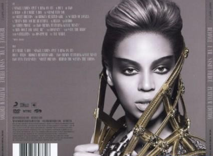
I am considering using this image again for the track list part of my digipak as I want to draw a clear link between the two products.

For this, I would crop the image and place the track list on one side in the same way big stars like Beyonce and Adele have done for previous album covers. By imitating other music artists, I will increase the realism of my overall product.

The rest of the digipak should maintain the gritty, black and white colour and I should take shots of the cityscape/tall buildings around evening time so I can hopefully capture the sunset behind the emerging silhouette of the city. I can take the images on my iPhone on the "panoramic" setting and crop the parts I want. I hope to use a good city scape image stretching across the interior panels of my digipak with tones of purple, orange and blue to contrast the black and white images. I want to either take or edit the images so they are blurred with just the speckled lights visible.

Here are some images that I have taken to use for part of my digipak. I ensured that they were slightly blurred to avoid the fact that they were not of London's buildings as I would have preferred. On reflection, these high rise block of flats are probably more suitable for my project as a glossy, structured London cityscape would defeat the object of achieving a gritty, urban look.
.jpg) |
.jpg) |
| If possible would have to brighten this image to some degree to avoid it looking too obscured. I could edit this image in Photoshop as a montage to create the look of several buildings protruding in the frame. |
 |
| Increasing the brightness and reducing the contrast to bring out the shape of the buildings slightly |
 |
| To alter the brightness of some lights in the picture I changed the colour levels. |
 |
| To copy and paste the one building to give the impression of a full cityscape, I drew a box over the section I wanted to copy > Edit > Copy Merged > Paste. In order to move the pasted sections around I ensured I selected the correct layer and then the select tool. |
.jpg)
.jpg)
.jpg)
.jpg)
.jpg)
.jpg)
Friday, 27 February 2015
Constructing the Advert
My previous post was dedicated to the construction of my digipak however I have decided to re-use one of the images again for my magazine advert. I found this image to be most suitable for my advert because for the digipak, I want to include close up shots and cityscape shots instead. To ensure that the two products are coherent, I want to continue the use of black and white- I am also considering using this particular image again for the track list of the digipak.
 I have already edited the image on an app called VSCOcam but in order to make the magazine advert I am using Photoshop. In order to add a border I changed the width and height on "Canvas Size" to make it larger than the scaling of the image itself. This way I can go onto using the paint bucket tool to fill in the white with black.
 |
| Black background |
I also used dafont.com to find a font suitable for the advert:

I am thinking of settling for a brush effect:
- "Levi ReBrushed"

- "Da Streets"

I feel that they look fresh, urban and youthful; I associate them with grafitti/street art. To download texts I go to "download"- it will save as a .zip file. In order to use to text I need to restart Photoshop and I can then find the text under the text drop-bar.

Things I could include:
- Artist's name*
- Album title*
- Song title*
- Image of the artist*
- Logos i.e. iTunes, HMV, Amazon etc.*
- Ratings i.e. 4 stars with a quote from "The Guardian" or "NME" for example
- Date of release/"Out Now"
- Website


Wednesday, 25 February 2015
Constructing the Digipak
I have started to take some digipak/magazine advert images in urban landscapes. The idea for location came from my music video as I feel that the three products should link to create a recognisable product.
One of my influences was PJ Harvey who takes shots of her positioned very centrally, standing or walking towards/away from the camera, edited with high contrast, often in black and white. The chiaroscuro effect in the second image is particularly appealing and works well in black and white. The obscured face creates a sense of mystery and this incites the audience's interest to learn more about the artist. In addition to this, the darkness is depressive which suits the lyrics and message of my song and music video.


I want to try and imitate this effect for my front cover as it looks professional and reflects the look and feel of real album covers:


Own images:
The images on the left are unedited and in colour but I have edited them on an app called "VSCOcam". I increased the contrast, reduced brightness and reduced temperature to highlight the light areas which created a gritty, dark image which achieves the urban look. I prefer the first image as it looks more balanced. While I like the authentic look of the subtle sun-spot in the second image, I could try to use Photoshop to edit this into the first image.


For this, I want to use one of these images for my track list by cropping the image and placing the track list on one side in the same way big stars like Beyonce and Adele have done for previous album covers. By imitating other music artists, I can increase the realism of my overall product.
The rest of the digipak should maintain the gritty, black and white colour and I should take shots of the cityscape around evening time so I can hopefully capture the sunset behind the emerging silhouette of the city. I can take the images on my iPhone on the "panoramic" setting and crop the parts I want. I hope to use a good city scape image stretching across the interior panels of my digipak with tones of purple, orange and blue to contrast the black and white images. These images do not need to be particularly clear as I plan on reducing the sharpness/clarity of the image on Photoshop to create a blurred effect.
Further plans:
- Take close-ups for the front cover and magazine advert in the style of PJ Harvey, Lianne La Havas and Rihanna
- Take some cityscape shots for the inside panels of the digipak
I took some images for the digipak for the front/back cover however I am concerned that they do not compliment the magazine advert sufficiently. I may need to
.jpg)
.jpg)
.jpg)

Sunday, 22 February 2015
Final footage
I have reviewed the last of the footage that I filmed near Southbank but none of the shots are suitable to use.


While I like the look of this shot, the part where I am singing the second verse is not lip synced correctly because it was outside and windy and therefore it was difficult to hear the music. It also wasn't performed very well- next time I film the whole take I should emphasise this part of the song as it is the only section without performance footage.
I should be able to use this shot of me walking towards the end of the pier in the montage part but I should increase the scale to zoom into the figure.
While it is best if I go out on location to shoot, being able to go anywhere with a good landscape locally is difficult. With the aim to finish this music video by the 2nd April, I may have to film part indoors again. In order to do this I need to be creative with the space I work with so it is not too repetitive.
Friday, 20 February 2015
Final stages of editing
The filming of the music video is complete, I now need to export the remaining shots as I have an entire verse with missing footage. I have highlighted all of the sections that need extra shots put in for future reference; with the remaining footage I can also complete the montage of shots at the end of the song. If the remaining shots are not suitable for these sections I will need to plan an extra filming date. Extra features could include: editing colour (black and white, contrast, brightness etc.), transitions between shots and speed (reducing speed for dramatic emphasis).


Monday, 26 January 2015
Magazine advert
As well as creating a digipak, I also need to make a magazine advert for my artist as another form of promotion.
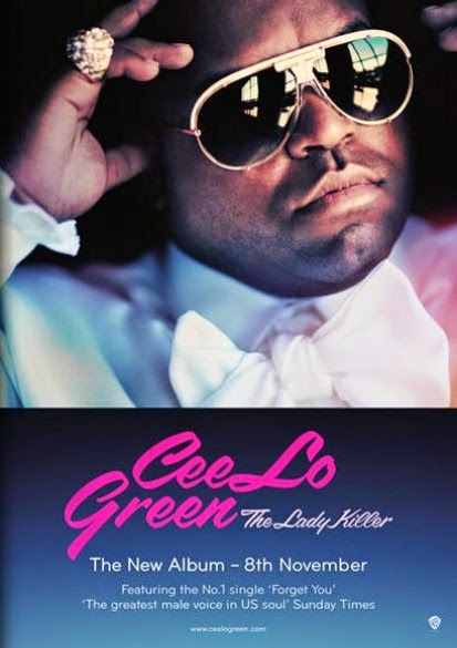 This magazine advert features only CeeLo Green, as he is a solo artist. The colours, mood and style reflect his own personal style and genre of music; the subdued pink and orange tones against the blue is reminiscent of the soul/RnB genre. Likewise, the "glamour" of such genres is represented in his crisp white shirt, bow tie, gold rimmed sunglasses and large gold ring. The colour of the font section matches the colour of the image which creates a sense of flow and consistency. It is visually pleasing to draw a visible connection between the image and font particularly as his genre of music is often very smooth and calming. The pink, feminine font links with the album title "The Lady Killer" as it is evidently about women. Below the eye-catching artist name and album title is the release date and a review of the album. It would be particularly good to include a made-up review from someone reputable like The Guardian with five stars as in reality, this would help the album sell.
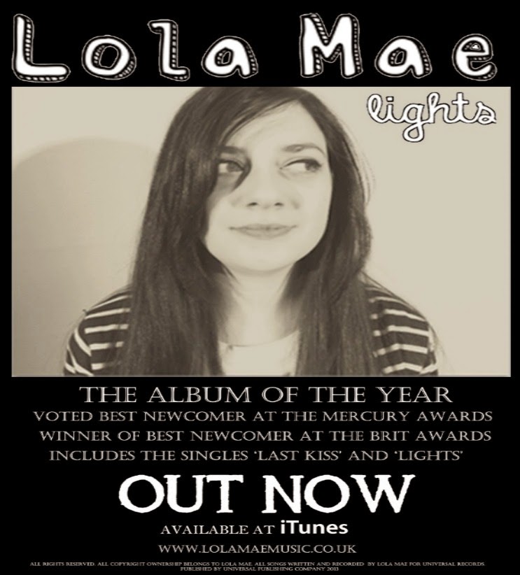 I find this to be a reasonably effective magazine advert as the sepia colour scheme is consistent throughout making it visually pleasing. However I feel that without some eye catching image or a bold coloured font/section like on CeeLo Green's advert, it may become less noticeable in a magazine where there will be other articles, font styles and colours surrounding it. The album title and image work well together as there appears to be a brighter spotlight shining onto one side of the artists face. Also, the size difference between the artist's name and album title are effective as it is the name of the artist that will attract the audience's attention first. I feel that although they lack the use of a bold title colour, the clear positioning of the artist name makes up for this. Perhaps there is too much writing- audiences won't be reading paragraphs on an advertisement that they are likely to just skim through so it is essential to keep it sharp, informative and clear. Nevertheless I like how the student has included the "available at iTunes" notice with the recognisable logo in bold. This also increases the realism of the advert alongside a "terms and conditions" section in small print at the very bottom.


For my own magazine advert:
1. Do it on A4 or A5
2. Include pictures that I have manipulated/altered in some way and explain how/why I have manipulated it
3. Include the name of the album, artist, release date
4. Refer to availability – e.g. ITunes, HMV, Amazon etc. and import these company images/logos from Google
5. Include positive reviews from magazines/newspapers (possibly 5 stars)
6. Add my own QR code, I could also create my own link
CeeLo Green:
This magazine advert features only CeeLo Green, as he is a solo artist. The colours, mood and style reflect his own personal style and genre of music; the subdued pink and orange tones against the blue is reminiscent of the soul/RnB genre. Likewise, the "glamour" of such genres is represented in his crisp white shirt, bow tie, gold rimmed sunglasses and large gold ring. The colour of the font section matches the colour of the image which creates a sense of flow and consistency. It is visually pleasing to draw a visible connection between the image and font particularly as his genre of music is often very smooth and calming. The pink, feminine font links with the album title "The Lady Killer" as it is evidently about women. Below the eye-catching artist name and album title is the release date and a review of the album. It would be particularly good to include a made-up review from someone reputable like The Guardian with five stars as in reality, this would help the album sell.
An example of another student's magazine advert:
I find this to be a reasonably effective magazine advert as the sepia colour scheme is consistent throughout making it visually pleasing. However I feel that without some eye catching image or a bold coloured font/section like on CeeLo Green's advert, it may become less noticeable in a magazine where there will be other articles, font styles and colours surrounding it. The album title and image work well together as there appears to be a brighter spotlight shining onto one side of the artists face. Also, the size difference between the artist's name and album title are effective as it is the name of the artist that will attract the audience's attention first. I feel that although they lack the use of a bold title colour, the clear positioning of the artist name makes up for this. Perhaps there is too much writing- audiences won't be reading paragraphs on an advertisement that they are likely to just skim through so it is essential to keep it sharp, informative and clear. Nevertheless I like how the student has included the "available at iTunes" notice with the recognisable logo in bold. This also increases the realism of the advert alongside a "terms and conditions" section in small print at the very bottom.
Some other examples of magazine adverts from current female artists:
Although they all produce different music the adverts all work effectively in the same way. Each advert includes an individual image of the artist with the name in bold which tells the audience that they are a solo artist. I have found that images against a plain background work best as it looks less cluttered. They also give information about singles on the album, reviews and availability.
1. Do it on A4 or A5
2. Include pictures that I have manipulated/altered in some way and explain how/why I have manipulated it
3. Include the name of the album, artist, release date
4. Refer to availability – e.g. ITunes, HMV, Amazon etc. and import these company images/logos from Google
5. Include positive reviews from magazines/newspapers (possibly 5 stars)
6. Add my own QR code, I could also create my own link
Subscribe to:
Comments (Atom)