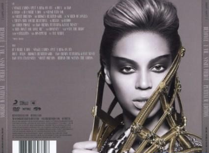
I am considering using this image again for the track list part of my digipak as I want to draw a clear link between the two products.

For this, I would crop the image and place the track list on one side in the same way big stars like Beyonce and Adele have done for previous album covers. By imitating other music artists, I will increase the realism of my overall product.

The rest of the digipak should maintain the gritty, black and white colour and I should take shots of the cityscape/tall buildings around evening time so I can hopefully capture the sunset behind the emerging silhouette of the city. I can take the images on my iPhone on the "panoramic" setting and crop the parts I want. I hope to use a good city scape image stretching across the interior panels of my digipak with tones of purple, orange and blue to contrast the black and white images. I want to either take or edit the images so they are blurred with just the speckled lights visible.
Here are some images that I have taken to use for part of my digipak. I ensured that they were slightly blurred to avoid the fact that they were not of London's buildings as I would have preferred. On reflection, these high rise block of flats are probably more suitable for my project as a glossy, structured London cityscape would defeat the object of achieving a gritty, urban look.
.jpg) |
 |
| Increasing the brightness and reducing the contrast to bring out the shape of the buildings slightly |
 |
| To alter the brightness of some lights in the picture I changed the colour levels. |


.jpg)

.jpg)
.jpg)
.jpg)
.jpg)
.jpg)
.jpg)
No comments:
Post a Comment