I have started to take some digipak/magazine advert images in urban landscapes. The idea for location came from my music video as I feel that the three products should link to create a recognisable product.
One of my influences was PJ Harvey who takes shots of her positioned very centrally, standing or walking towards/away from the camera, edited with high contrast, often in black and white. The chiaroscuro effect in the second image is particularly appealing and works well in black and white. The obscured face creates a sense of mystery and this incites the audience's interest to learn more about the artist. In addition to this, the darkness is depressive which suits the lyrics and message of my song and music video.


I want to try and imitate this effect for my front cover as it looks professional and reflects the look and feel of real album covers:


Own images:
The images on the left are unedited and in colour but I have edited them on an app called "VSCOcam". I increased the contrast, reduced brightness and reduced temperature to highlight the light areas which created a gritty, dark image which achieves the urban look. I prefer the first image as it looks more balanced. While I like the authentic look of the subtle sun-spot in the second image, I could try to use Photoshop to edit this into the first image.


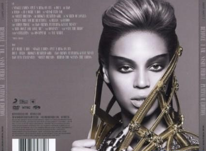
For this, I want to use one of these images for my track list by cropping the image and placing the track list on one side in the same way big stars like Beyonce and Adele have done for previous album covers. By imitating other music artists, I can increase the realism of my overall product.

The rest of the digipak should maintain the gritty, black and white colour and I should take shots of the cityscape around evening time so I can hopefully capture the sunset behind the emerging silhouette of the city. I can take the images on my iPhone on the "panoramic" setting and crop the parts I want. I hope to use a good city scape image stretching across the interior panels of my digipak with tones of purple, orange and blue to contrast the black and white images. These images do not need to be particularly clear as I plan on reducing the sharpness/clarity of the image on Photoshop to create a blurred effect.

Further plans:
- Take close-ups for the front cover and magazine advert in the style of PJ Harvey, Lianne La Havas and Rihanna
- Take some cityscape shots for the inside panels of the digipak
I took some images for the digipak for the front/back cover however I am concerned that they do not compliment the magazine advert sufficiently. I may need to
.jpg)
.jpg)
.jpg)

No comments:
Post a Comment