Friday 20 March 2015

Audience Feedback

I asked a group of people from my target audience for feedback on my final products: the music video, magazine advert and digipak. Overall the comments were generally positive however there are things that could be improved to enhance the appearance and promotional value of each product.

One person commented on the “good performance” throughout in terms of facial expressions and body language because it mirrored the melancholy tone of the song. However I did receive comments on how some shots felt repetitive. I agree with this to an extent because I should have filmed in even more outdoor locations with more dynamic shots using the monopod. However I found this difficult to do while working and managing the project alone as I had to rely on a friend to help with certain angles and shots each time I filmed outside. Nevertheless, they enjoyed the montage part as they felt that it correlated with the changing tempo of the song and heightened the emotion of the song and music video.


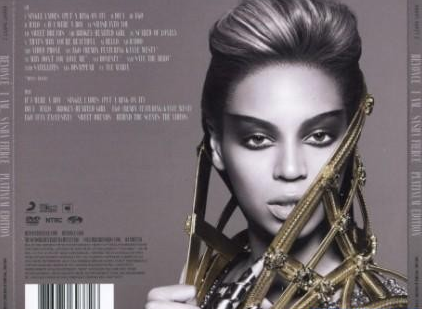
The outdoor locations used in my music video were recognised in my ancillary texts- particularly with the “panoramic” shot in the digipak. My audience felt that this drew the products together and when asking them if they recognised the same pattern in any real artists’ work they agreed. As a result, I feel that this increases the realism of my product. The only negative about the ancillary texts is that the digipak was “less interesting” than the other products. Although they liked the use of Photoshop for the panoramic image and the photography throughout, the general comments gave me the impression that I could have included more images instead of a plain background with text. However, they noticed the consistent black and white colour scheme across the two ancillary texts which linked them together.

Wednesday 11 March 2015

Finished Music Video

Finished Digipak


Finished Advert


Music Video Rough Cut/Feedback

This is the rough cut of my music video, I still need to import the remaining footage for one of the song's verses and cut some of the shots into the montage at the end. I may also include some video transitions between verses and choruses as all I have is sharp cuts so far.


Overall, I received positive feedback on my rough cut despite being limited in shots throughout. They were particularly impressed with the montage at the end where they were refreshed with snippets of the music video in its entirety. One said it created a sense of chronological order and added to the emotion and drama of the music. Another mentioned how well it was edited to the beat.

The main criticism was on the repetitiveness of some of the shots- this is understandable as I am yet to film in other locations with varying costumes. They also mentioned that there is too much "black" i.e. gaps. I will need to plan my final filming as soon as possible to fix this and to complete the final product.


Tuesday 3 March 2015

Constructing the Digipak (updated)

I am considering using this image again for the track list part of my digipak as I want to draw a clear link between the two products. 


For this, I would crop the image and place the track list on one side in the same way big stars like Beyonce and Adele have done for previous album covers. By imitating other music artists, I will increase the realism of my overall product.


The rest of the digipak should maintain the gritty, black and white colour and I should take shots of the cityscape/tall buildings around evening time so I can hopefully capture the sunset behind the emerging silhouette of the city. I can take the images on my iPhone on the "panoramic" setting and crop the parts I want. I hope to use a good city scape image stretching across the interior panels of my digipak with tones of purple, orange and blue to contrast the black and white images. I want to either take or edit the images so they are blurred with just the speckled lights visible. 


Here are some images that I have taken to use for part of my digipak. I ensured that they were slightly blurred to avoid the fact that they were not of London's buildings as I would have preferred. On reflection, these high rise block of flats are probably more suitable for my project as a glossy, structured London cityscape would defeat the object of achieving a gritty, urban look. 


If possible would have to brighten this image to some degree to avoid it looking too obscured. I could edit this image in Photoshop as a montage to create the look of several buildings protruding in the frame.

Increasing the brightness and reducing the contrast to bring out the shape of the buildings slightly

To alter the brightness of some lights in the picture I changed the colour levels.

To copy and paste the one building to give the impression of a full cityscape, I drew a box over the section I wanted to copy > Edit > Copy Merged > Paste. In order to move the pasted sections around I ensured I selected the correct layer and then the select tool.